Introduction
If you’ve ever sat through a status meeting where five teams brought five versions of the truth, you know how fast momentum dies. I’ve watched leadership debates stall for weeks because one spreadsheet said green while a finance system screamed red.
A project dashboard fixes that by creating a single, trusted view—one that everyone from the intern to the CEO can act on. In this guide, I’ll explain what a project dashboard really is, when each type works best, and how to build one that gets used (not ignored). I’ll also share lessons from my 20+ years in the IT industry and from helping build Karya Keeper, our AI-powered project management tool.
What Is a Project Dashboard?
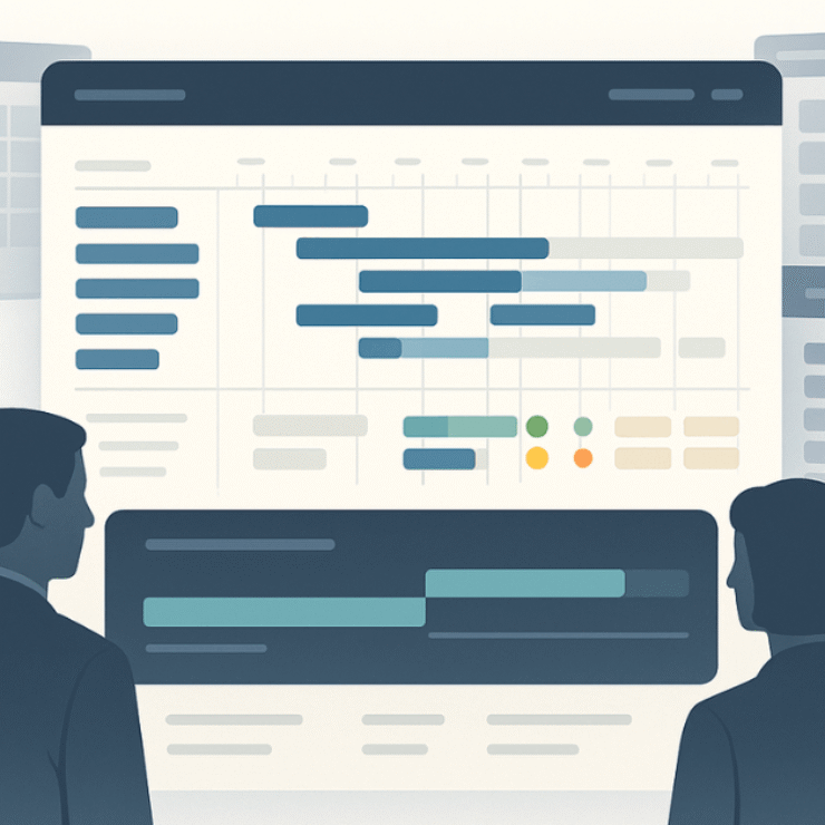
A project dashboard is a real-time visual hub for your project’s most important signals—timeline, budget, risks, progress, and capacity. But here’s the test I use with every client: If a metric doesn’t help someone make a decision right now, it doesn’t belong on the dashboard.
Key questions your dashboard should answer at a glance:
- Are we on track or slipping?
- What risks actually need attention?
- Do we have the people and budget to deliver?
- What’s the likely impact on our business goals?
Why this matters: Large IT projects run 45% over budget and 7% over time on average, while delivering 56% less value than predicted—a visibility problem that dashboards are built to fix.
Real-life example: I led a digital transformation program where reports took two weeks to compile. By the time leadership saw them, reality had moved on. That’s when it clicked for me: dashboards aren’t “pretty charts”—they’re decision accelerators that close the gap between what’s happening and what leaders see.
Today, with tools like Karya Keeper, those updates are near real time—so teams can act before issues snowball.
Types of Project Dashboards (and When They Work Best)
One-size-fits-all dashboards fail. Design for the audience and the decisions they need to make.
1) Project Status Dashboard (single project)
Your daily driver as a PM: task completion vs pending, upcoming deadlines, resource allocation, and current risks. Use it for execution clarity and daily standups.
2) Portfolio / PMO Dashboard (many projects)
For leaders who need a 30,000-foot view: which projects are healthy, where spend is drifting, compounding risks, and alignment to strategy. Use it for budgeting and prioritization.
3) Executive Dashboard
Executives care about outcomes, not task counts: ROI, delivery confidence, and top risks. Keep it visual and outcome-driven; less detail, more signal.
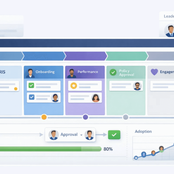
4) Team-Specific Dashboards
- Engineering: sprint velocity, backlog health, defect leakage
- Marketing: campaign ROI, deadlines, in-flight approvals
- HR: hiring funnel, time-to-hire, onboarding progress
- Construction/Operations: site milestones, variance to plan, utilization
Real-life example: At an enterprise client, we split “one mega dashboard” into role-specific views. Engineers tracked code velocity; leadership tracked defect leakage. Meeting time dropped ~30% and decisions sped up because each person finally saw only what mattered to them.
Project Dashboard Examples (With Practical Scenarios)
- Product Launch Dashboard
Top strip: % features complete, sprint progress, open bugs.
Middle: key risks flagged (e.g., vendor delays).
Bottom: budget burn vs plan and “next actions” tile. - Construction Dashboard
Timeline of site milestones, variance chart, materials/utilization summary, and a risk heatmap. - HR Recruitment Dashboard
Funnel from applicants → interviews → offers → onboarded, time-to-hire, and bottleneck alerts.
Real-life example: A CFO I worked with kept getting blindsided by cost overruns. We implemented a daily actual-vs-budget view with early-warning thresholds. Finance began spotting overruns weeks earlier and surprise escalations fell by ~40%.
What to Show (And What to Leave Out)
Dashboards fail when they try to show everything. Focus on the vital few:
- Schedule variance: ahead/on track/slipping
- Budget health: actual vs plan (and forecast)
- Milestone hit rate: reliability of delivery
- Risk exposure: clear thresholds, owners, dates
- Capacity vs demand: can the team absorb the plan?
Mentor tip: Always mix leading indicators (velocity, % tasks at risk, pipeline strength) with lagging indicators (milestones completed). Leading indicators let you act before the red lights flash.
Project Dashboard Best Practices (2025 Edition)
- Role-based views: executives ≠ PMOs ≠ delivery teams.
- Mobile-first: dashboards must be scannable on a phone.
- AI summaries: plain-English “why” and “what next” improve adoption.
- Privacy by design: show only what’s necessary; protect sensitive details.
- Clarity over completeness: if everything is important, nothing is.
Real-life example: I’ve seen 20-widget dashboards no one opened. We cut to six KPIs and usage spiked. The lesson I bring to every build: people return to clarity.
How to Build a Project Dashboard (Step-by-Step)
Most failed dashboards start with the tool—not the decision. Flip that script:
1) Nail the audience & decisions
Name the audience and write two lines: “This dashboard helps X decide Y, weekly/daily.” If a metric doesn’t serve that decision, drop it.
2) Choose 5–7 KPIs that move the needle
Schedule, budget, milestone health, capacity vs load, and top risks/issues. Define each KPI (owner, source, refresh, threshold).
3) Pick the right tool for where you are
- Starting out: Google Sheets/Excel/Notion (fast, flexible)
- Scaling teams: Trello/Asana/Karya Keeper (real-time task + dashboard)
- Enterprise roll-ups: Power BI/Tableau/Jira + plugins (governed data, drill-downs)
4) Design the layout like a newspaper
- Above the fold: must-know KPIs and trend arrows
- Middle: context charts (burn rate, velocity, forecast)
- Bottom: risks, owners, next actions, and notes
5) Connect reliable data (and show freshness)
Automate where possible (task tracker, timesheets, finance). If manual, set a refresh SLA (daily/weekly) and stamp “Last updated” on the page to build trust.
PMI reports fewer than two-thirds of projects meet their goals, and ~17% fail outright—poor visibility is a major contributor. Dashboards with consistent refresh reduce that blind spot.
6) Test with real users
Ask: “What helped you decide faster?” “What felt like noise?” Iterate. Replace low-signal widgets with “next actions” or forward-looking metrics.
7) Roll out with a 30/60/90 adoption plan
- 30: pilot with one project; tune thresholds, add AI summaries
- 60: extend to adjacent teams; train champions; deprecate duplicate reports
- 90: formalize governance (KPI owners, refresh SLA, access), and add portfolio/executive layers
Governance: Data Quality, Ownership, and Access
Trust drives adoption:
- Owners: one person per KPI (accountable for definition + accuracy)
- Data dictionary: shared meaning (e.g., what “on-time” means)
- Refresh SLA: cadence + timestamp visible on every dashboard
- Role-based access: minimize sensitive exposure, maximize relevance
Research shows only ~31% of projects fully succeed; ~50% end up exceeding the deadline and budget and ~19% get canceled—visibility and early intervention are critical. Dashboards make both possible.
Common Mistakes (And How to Fix Them)
Mistake 1: Treating dashboards like fancy reports
Fix: Reports are for record-keeping; dashboards are for real-time decisions. Write the decision statement at the top of your spec and prune ruthlessly.
Mistake 2: Too many KPIs
Fix: Cap at 5–7. Map each KPI to a decision; if you can’t, it’s a report metric—move it out.
Mistake 3: Ignoring leading indicators
Fix: Add early-warning metrics (velocity trends, % tasks at risk, forecast variance). They buy you time to act.
Mistake 4: Stale data
Fix: Automate. If you can’t, set a visible refresh SLA and enforce it. No timestamp = no trust.
Mistake 5: One dashboard for everyone
Fix: Split into role-based views (Exec, PMO, Team). Adoption will jump because relevance jumps.
Mistake 6: Skipping change management
Fix: Train, collect feedback, and turn off redundant spreadsheets. Adoption needs both carrot and stick.
Research shows Agile projects are ~3× more likely to succeed than Waterfall—a big reason is iterative visibility and course-correction, which dashboards amplify.
Final Word
After two decades in IT and countless dashboard rollouts, here’s the pattern I trust: focus beats volume. Teams win when the dashboard is clear, current, and tied to decisions—not when it’s a wall of charts.
If you’re starting today:
- Write the decision this dashboard must enable.
- Pick 5–7 KPIs and define owners + refresh SLAs.
- Design for clarity, ship a pilot, and iterate.
- Add AI summaries and role-based views as adoption grows.
Think of your dashboard as your project’s daily newspaper—short, trusted, and actionable. If your team reads it and takes one concrete action every day, you’ve already changed the trajectory.
That’s the philosophy we used while shaping Karya Keeper—clarity over complexity, decisions over decoration.
FAQs
Dashboard vs. report—what’s the practical difference?
Reports are static and backward-looking (great for audits). Dashboards are living, refreshed to match decision cadence, and built for action.
What should a project dashboard include?
Only what drives decisions now: schedule, budget, milestone health, top risks, and capacity vs load. If a widget doesn’t change a decision, it’s noise.
How do I build one without expensive tools?
Start with Google Sheets or Excel. Use RAG (Red/Amber/Green) thresholds, a tiny “KPI strip” at the top, a single budget vs plan chart, and a “next actions” box. Upgrade to Karya Keeper/Power BI when you outgrow manual refresh.
What are the best practices for 2025?
Role-based views, mobile-first layouts, AI summaries (why/what next), strict refresh SLAs, and privacy-by-design access.
How often should I refresh the dashboard?
Match refresh to decision frequency. Daily for active delivery, weekly for exec reviews. If the data is stale, people will stop trusting it.